Letter As Form
Micro Typography explores the details of individual letterforms. Students study how letters are designed and how words are formed through optical spacing. They learn about type anatomy, spacing, line length, line height, legibility, typeface selection, and historical context.
Institution: Lehigh University
Course Level: Graphic Design Introductory Studio, Beginner
Duration: 2 weeks
Part I
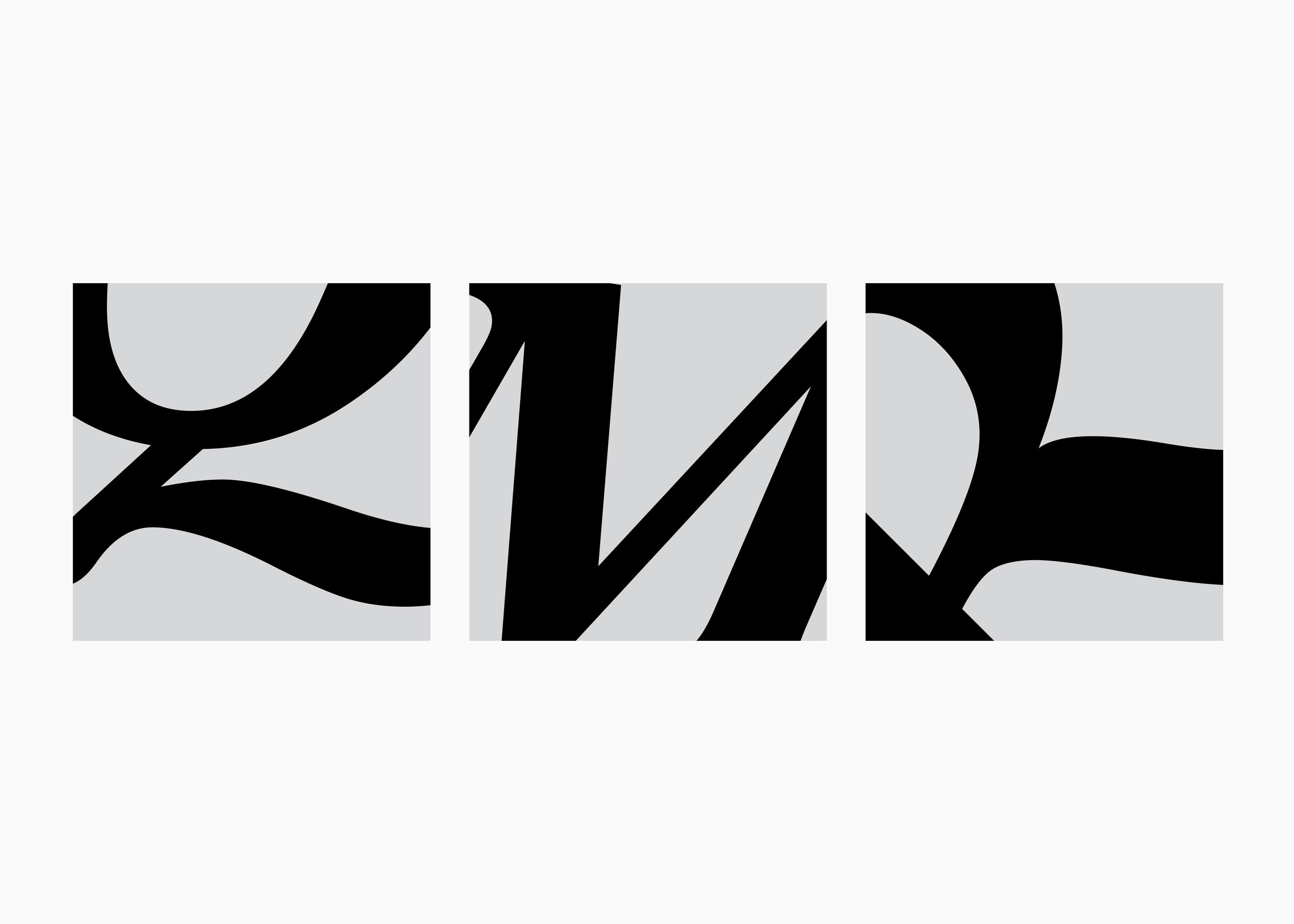
Design nine compositions, each featuring a single letterform per square. You may use one typeface for all compositions, such as Futura, or multiple typefaces across the five classifications introduced in class: Old Style Serifs, Transitional Serifs, Modern Serifs, Slab Serifs, and Sans Serifs.
Choose letters that interest you and explore their style and weight
You may rotate, enlarge, or reverse letters in black and white
Use heavier weights and consider contrast and abstraction
Letters can be scaled or bleed off the page
Part I Constraints & Parameters
File size: 7 by 7 inches
Use Adobe InDesign
No drop shadows or distorted scaling
Black and white or grayscale only
Use fonts from the provided list
Export as a high-quality PDF without crop marks or bleed
Part II
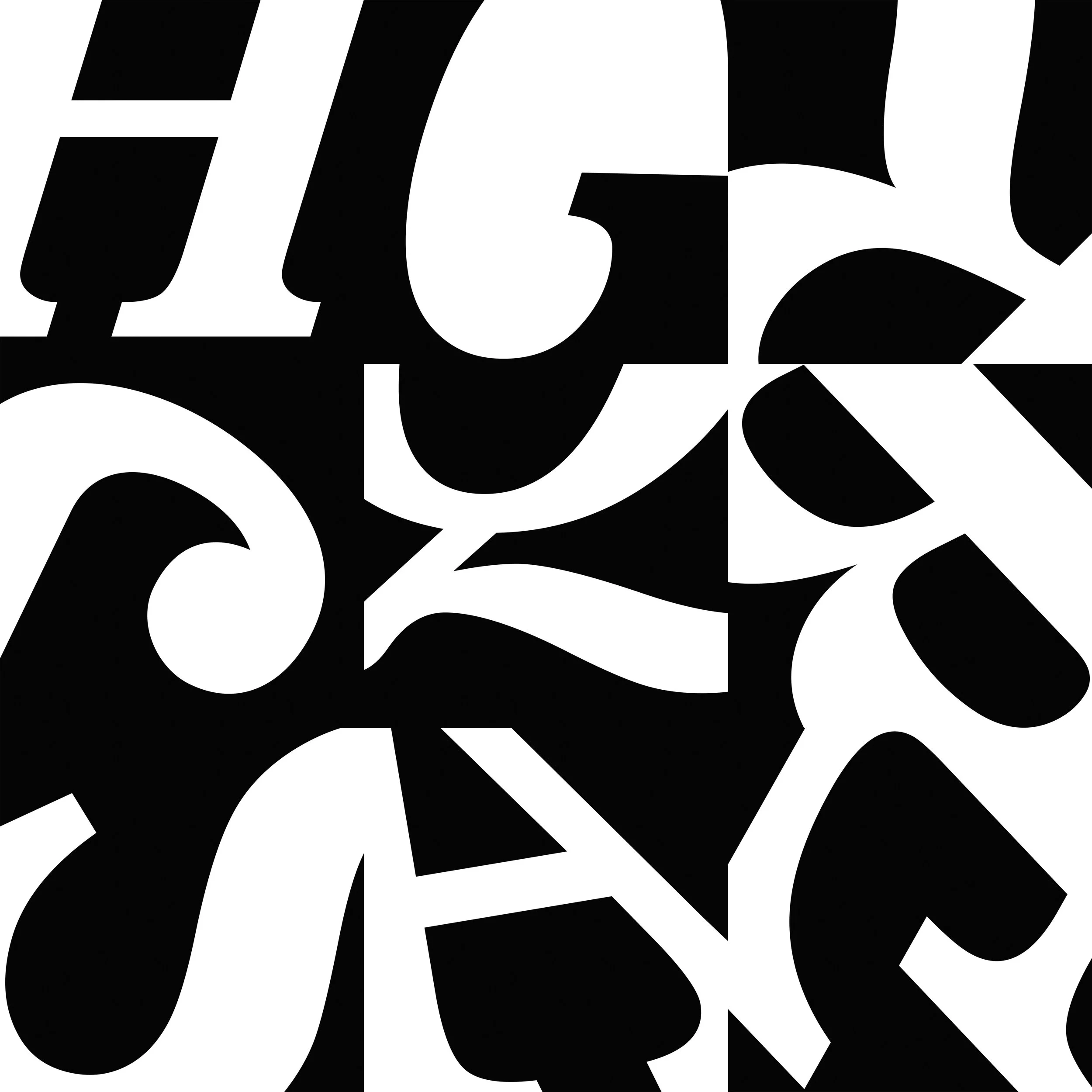
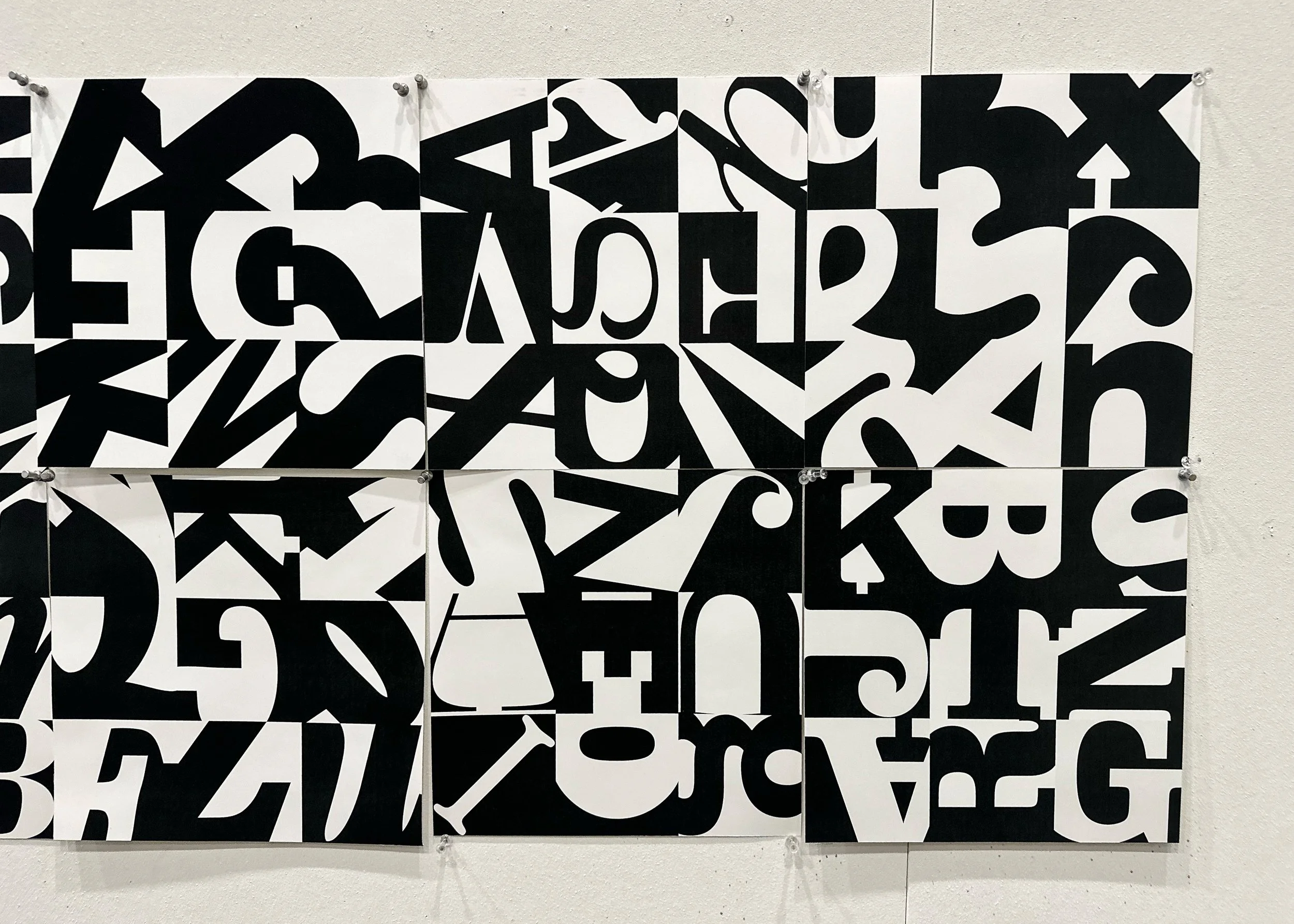
Arrange the nine compositions into a single layout within three columns and three rows. You may rotate and position each square within the grid. Pay attention to contrast, rhythm, and balance, and for a cohesive tonal range, squares can be placed edge-to-edge.
Part II Constraints & Parameters
File size: 21 by 21 inches
Place and arrange squares at 100 percent scale

Learning Objectives
Critically evaluate and examine letterforms
Identify differences across industry-standard type classifications
Explore abstract compositions through scale and cropping
Apply Design and Gestalt principles
Use industry-standard software for layout and composition
Practice an iterative design process
Develop an appreciation for type designers and their craft
Elevate the work through meticulous attention to detail
Learn print production techniques and hands-on studio skills
Deliverables
Final high-quality print, trimmed to size
Accompanying PDF
Readings
The Elements of Typographic Style, Robert Bringhurst
Norman Ives: Constructions and Reconstructions, John T. Hill
Designing with Type, James Craig & Irene Korol Scala
Thoughts & Observations
Students at the introductory level are often unaware of the role typography plays in design. Exposure to micro typography builds a foundation for making better-informed design decisions. The assignment is structured in steps, allowing software skills to be developed in tandem with the visualization of creative solutions. I have found that students often want to skip Part One and move straight to the 3-by-3 grid, but the stepped approach encourages them to develop individual compositions first before taking on the challenge of combining them into a larger, cohesive design.