Hoefler&Co.
At Hoefler&Co., a renowned type foundry with a library of more than 1,500 fonts, I collaborated with Jonathan Hoefler as part of their marketing and web development team. I was responsible for designing type specimens and campaigns across print, digital platforms, and social channels. We built typographic artifacts that showcased new releases as real-world proofs of concept, demonstrating to the global design community how H&Co typefaces perform in practice.
Collaborators & Credits
Principal: Jonathan Hoefler
Typeface Designers: Andy Clymer, Jordan Bell, Colin Ford, Sara Soskolne, Troy Leinster
Creative Director: Brian Hennings
Designer: Maurizio Masi
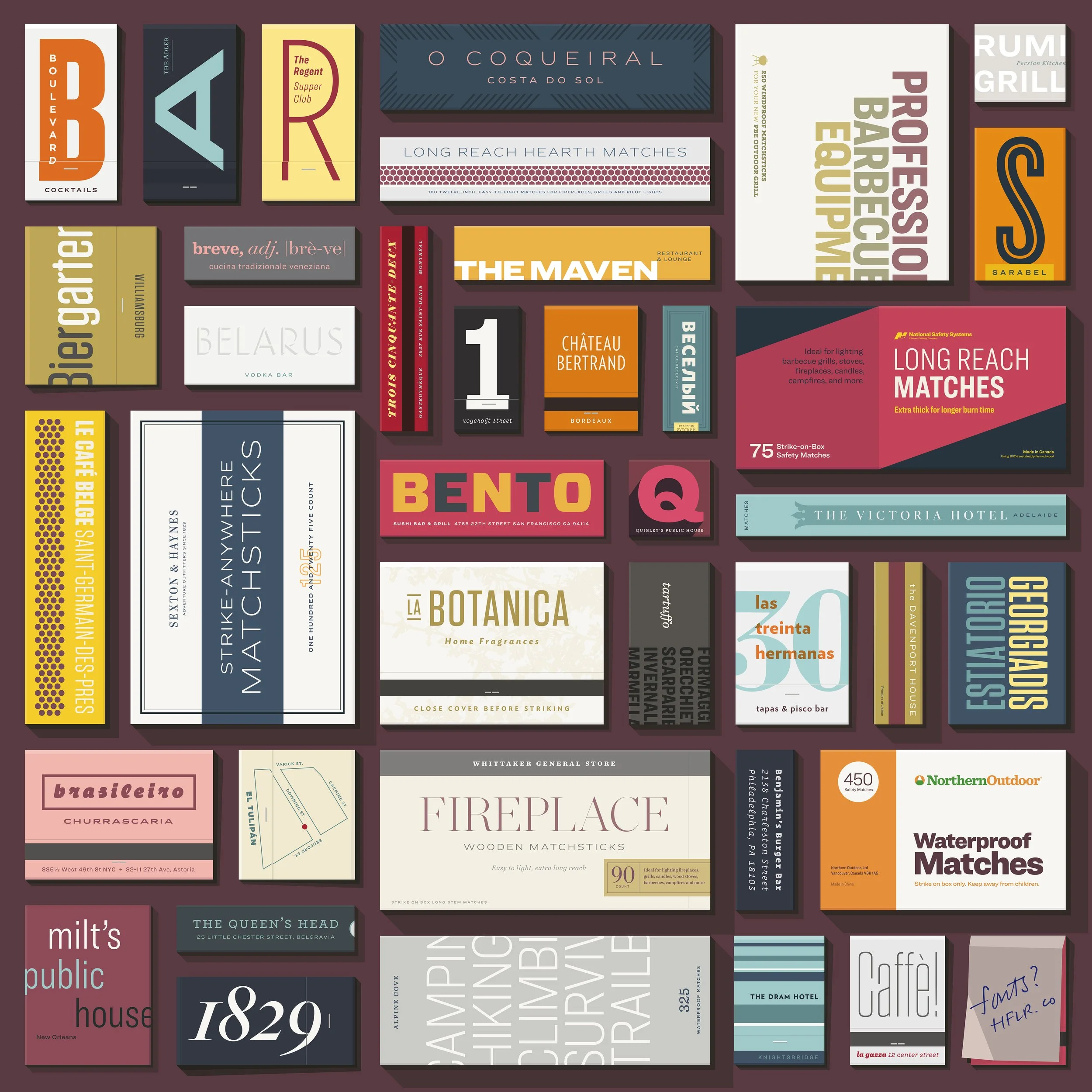
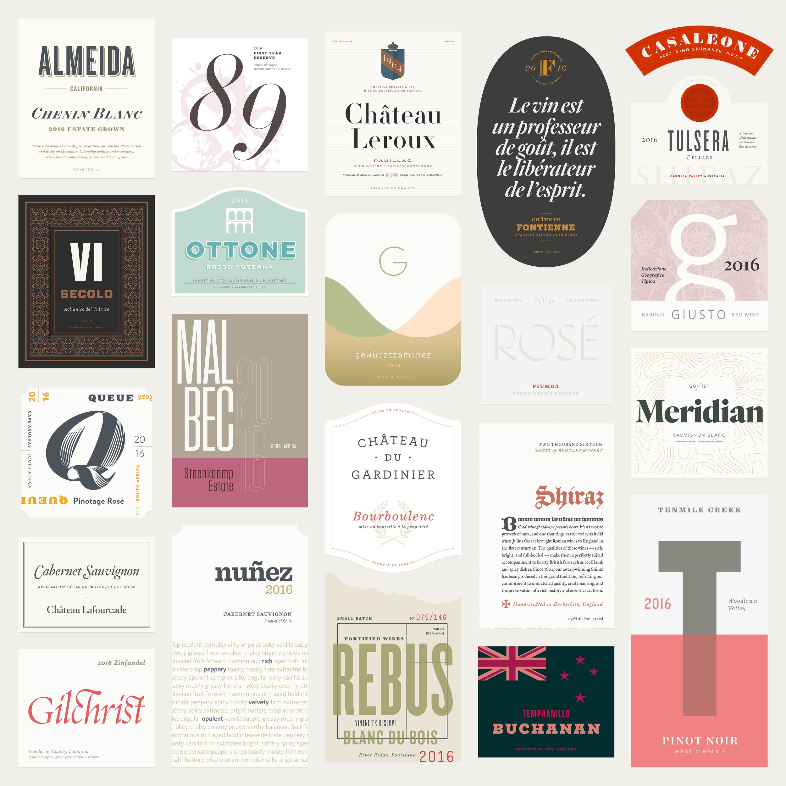
Unexpected Pairings
Discover.typography was an ingenious way to present an expansive range of typefaces through theme-based narratives. The work ranged from an eclectic library of wine labels for fictional vineyards to a series of thirty-nine small-scale matchbooks and boxes for cafés, restaurants, and hotels named after friends and family. The project was a labor of love grounded in storytelling, unexpected type pairing, and industry experience.
Designed for Diversity
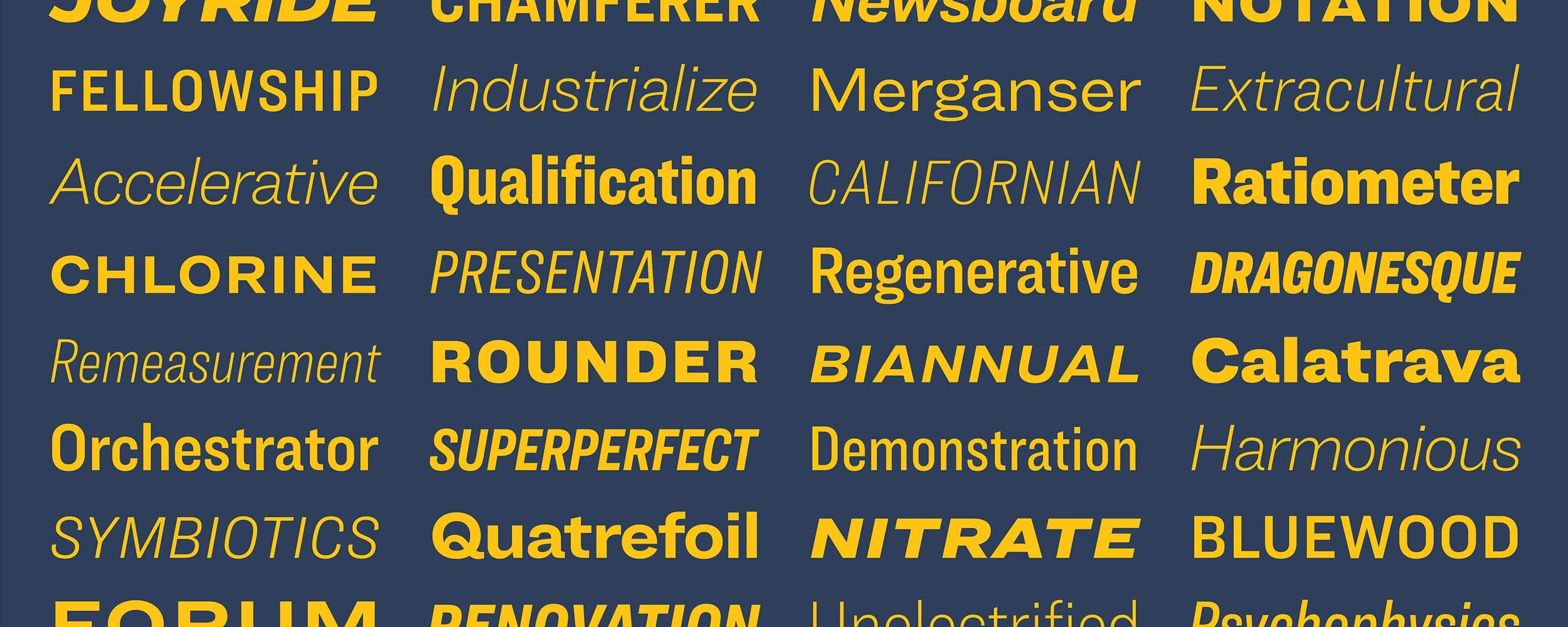
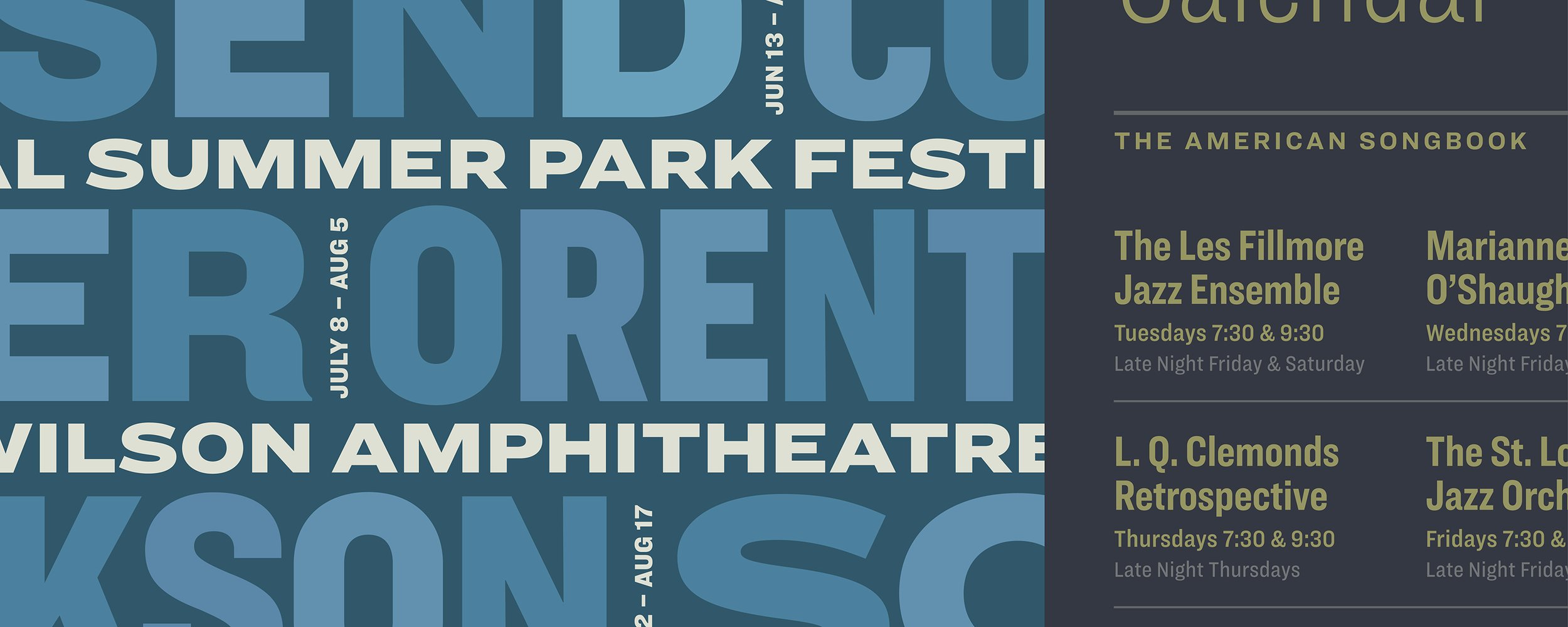
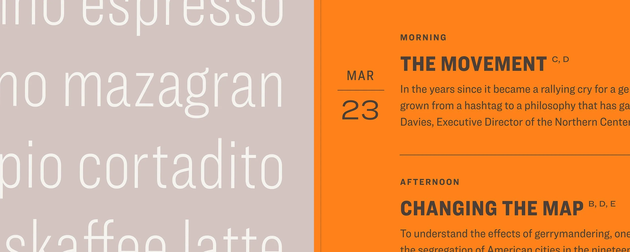
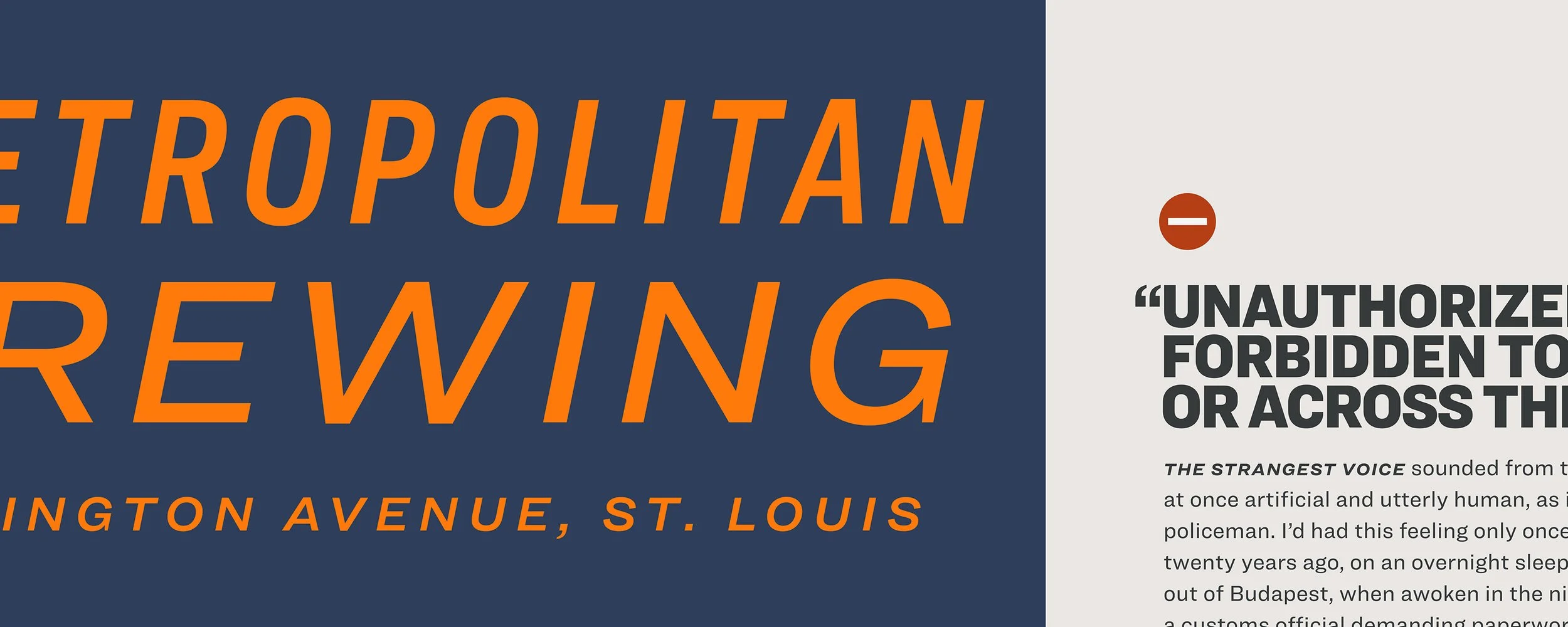
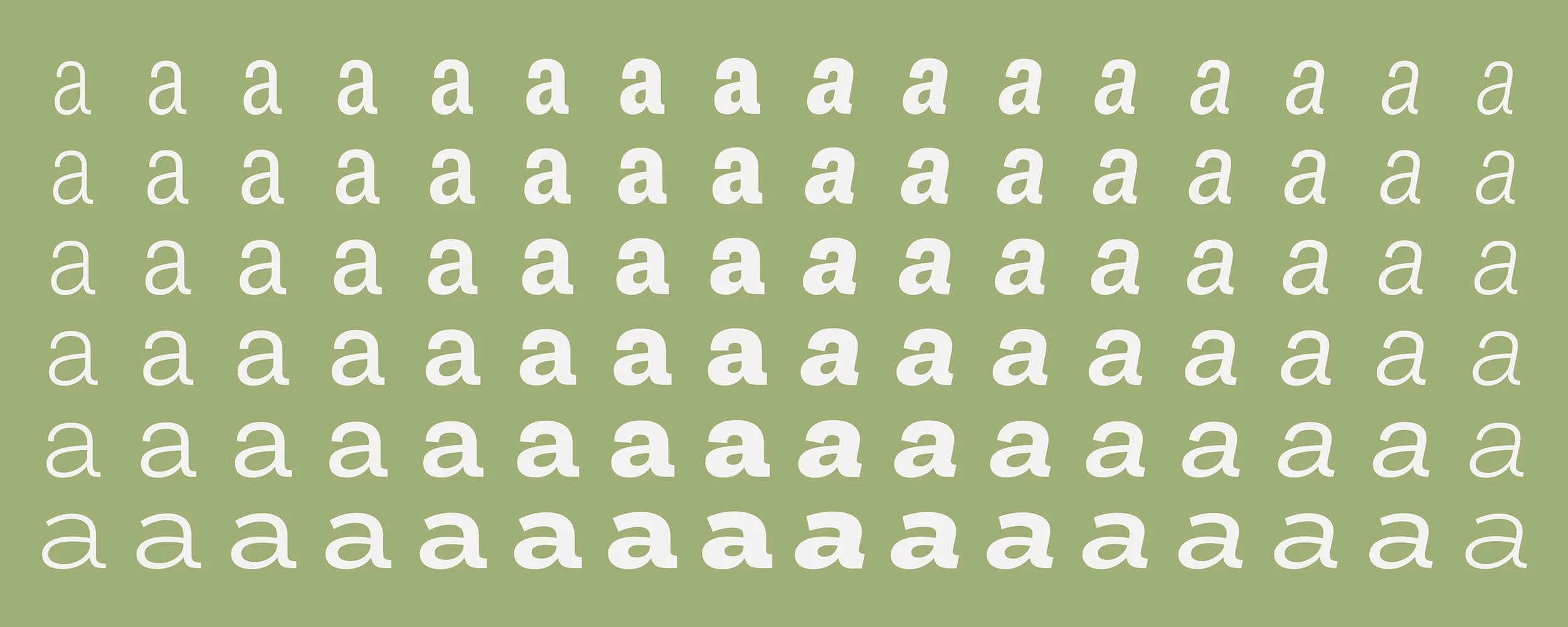
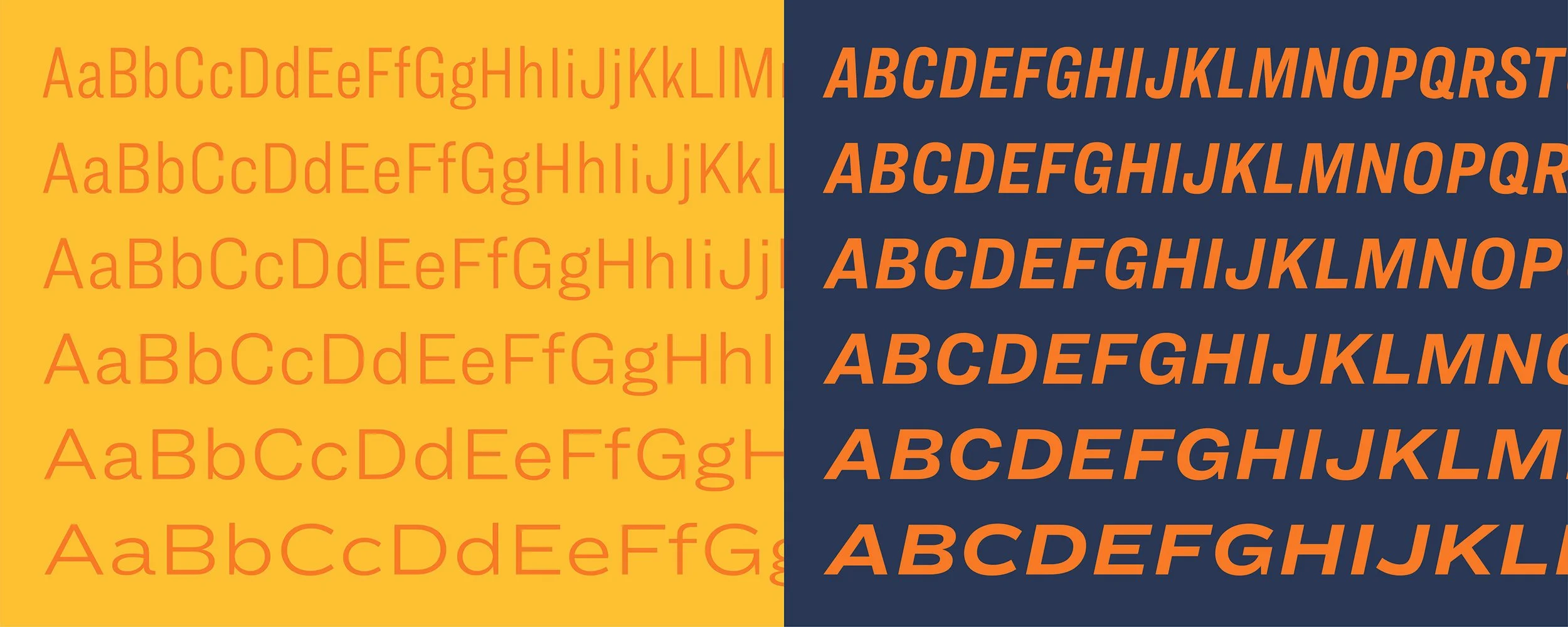
Ringside, a superfamily of sans serifs in six widths and ninety-six styles, was the threequel to Champion Gothic and Knockout, inspired by American wood types of the late nineteenth century. Specimens for H&Co’s font releases were presented as slideshows for designers to reference and archive. I designed this series to explore Ringside’s versatility across display headlines and functional, hierarchical typography.