Alphabet City
Two-dimensional design foundation courses guide students to work with abstraction and non-representational imagery. The Alphabet City exercise pushes them beyond typefaces on screen to notice engaging forms in everyday surroundings while reinforcing standard workflows in Adobe CC applications.
Institution: New York City College of Technology, Lehigh University
Course Level: Typography I, Graphic Design Introductory Studio, Beginner
Duration: 2 weeks
Exercise Brief
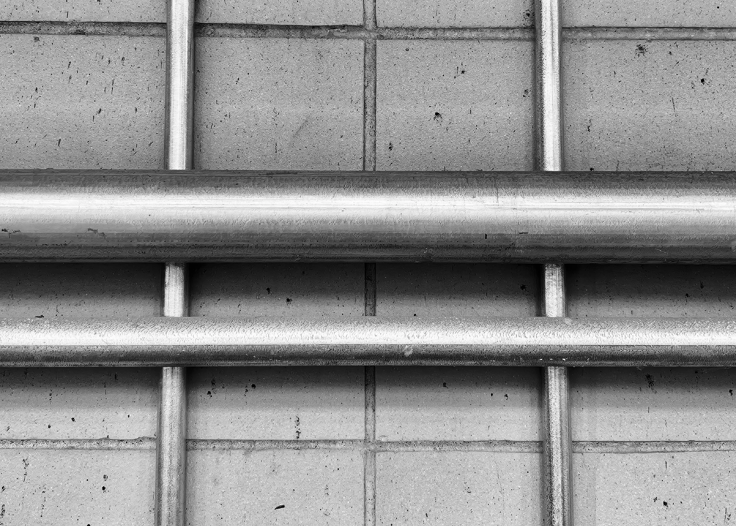
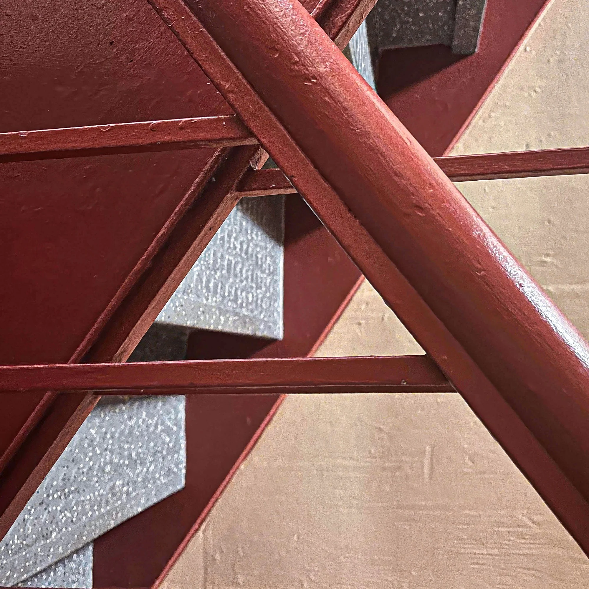
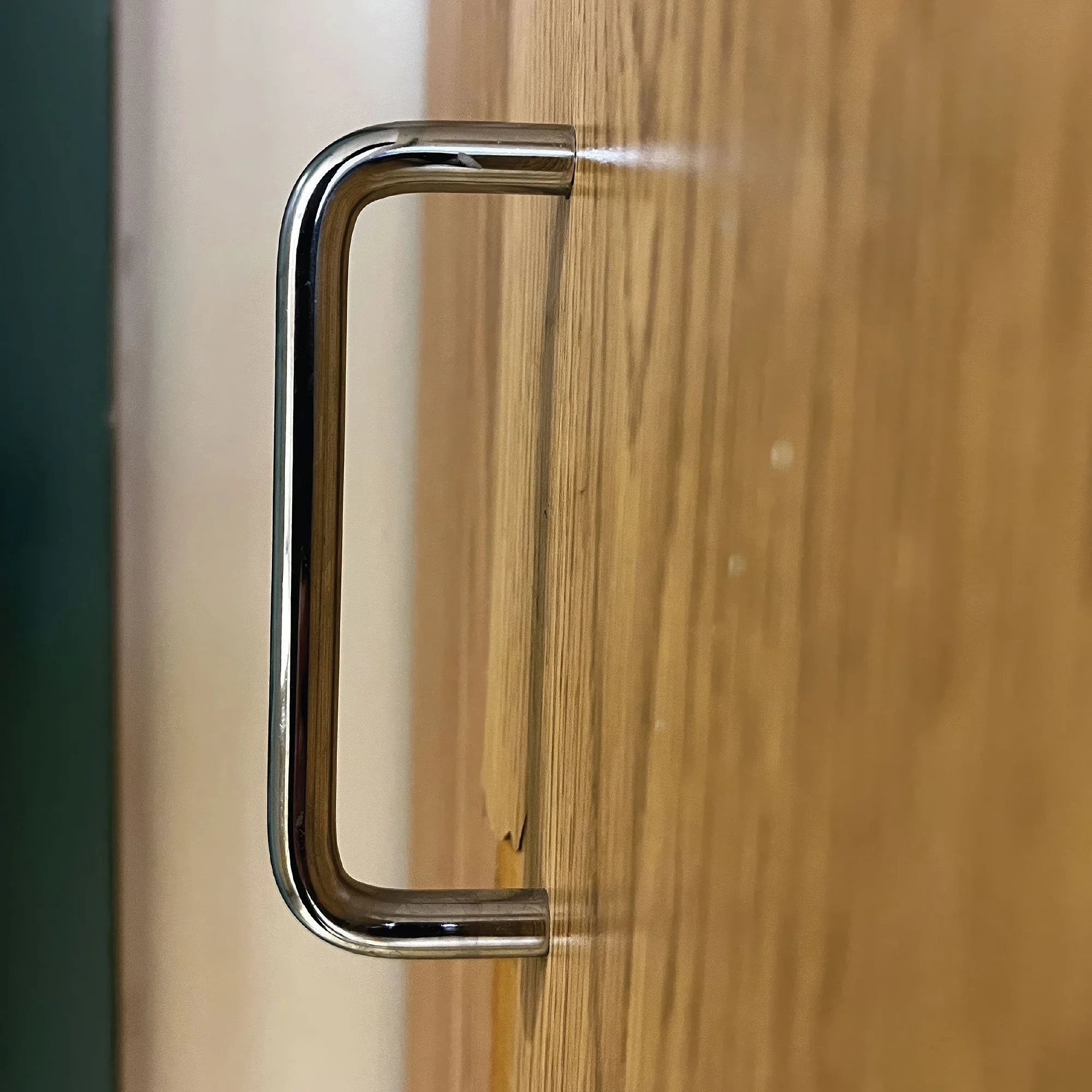
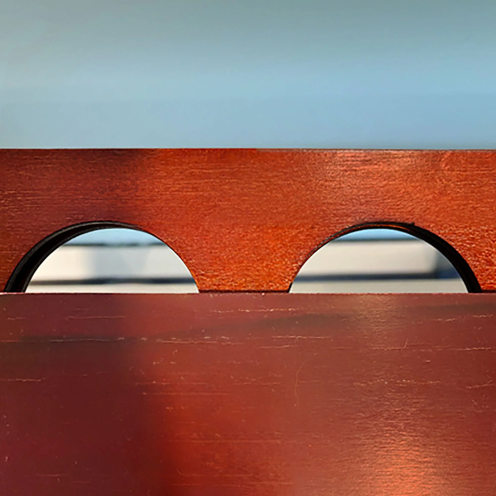
Understanding the fundamentals of typography begins with learning how to see. The title of this exercise changes depending on the class location. In an urban environment, it is called Alphabet City, in a rural setting, it becomes Letterforms in the Wild. 35mm black-and-white photography using manual single-lens reflex cameras was integral to the foundation curriculum of Commercial Art, now called Graphic Design. The rectangular viewfinder and limited field of vision trained designers to observe closely and crop images intentionally in real time.
For this exercise, use a camera: analog, digital, or your smartphone, to explore the letters around you. Pay attention to shapes and forms in your environment, whether indoors, outdoors, or on your commute. Shoot each one from different angles so you’ll have a variety of images to work with later.
Student work by Sophia San Agustin
Learning Objectives
Observe and interpret found letterforms in the environment
Experiment with abstraction and non-representational imagery
Apply Photoshop and Illustrator workflows for editing and layout
Break from conventional design methods and apply lateral thinking
Constraints & Parameters
Capture images in color—you can convert them to black and white later if needed
Use the highest resolution your device allows
Use Adobe Photoshop for any retouching and Adobe Illustrator for layout
Trim size: 7x7 in
Include an industry-standard bleed of 0.125 in
Letterforms may be represented in either uppercase or lowercase
Deliverables
26 letters, one version for each letterform, trimmed to scale
Broadside poster of all 26 letters arranged in a symmetrical or asymmetrical composition
Readings
Graphic Design: The New Basics, Ellen Lupton & Jennifer Cole Phillips
Designing with Type, 5th Edition: The Essential Guide to Typography, James Craig & Irene Korol Scala


Thoughts & Observations
Students are often surprised by what they can discover when they step away from conventional methods. Using a production checklist: covering high-resolution settings, experimenting with lens presets, capturing multiple perspectives, and retouching color and contrast helps them achieve stronger results. I also share inspiring examples, from Gail Anderson’s seminal work for Rolling Stone to Stefan Sagmeister’s outdoor typographic installations.
The major takeaway is that breaking from traditional approaches is not only possible but encouraged, and lateral thinking can be applied directly in professional practice.
Credits for student letters
Hyun Lee: Letter A
Joshua Lopez: Letter C
Sophia San Agustin: Letter H
Ashley Yoon: Letter I
Katrina Ferrante: Letter M
Jua Kim: Letter O
Amy Liao: Letter T
Rasanee Thapa: Letter W
Sav Thomas: Letter Y